Custom Dashboards
Build dashboards from traces, threads, metric data, and annotations — with breakdowns, filters, and CSV/PNG/PDF export.
Overview
Dashboards let you compose widgets — graphs, tables, and big-number tiles — over your project's traces, threads, metric data, and annotations. Each widget pulls live data, supports filters and breakdowns by dimensions like classifier labels, end users, or metadata keys, and can be exported as CSV, PNG, or PDF for sharing.
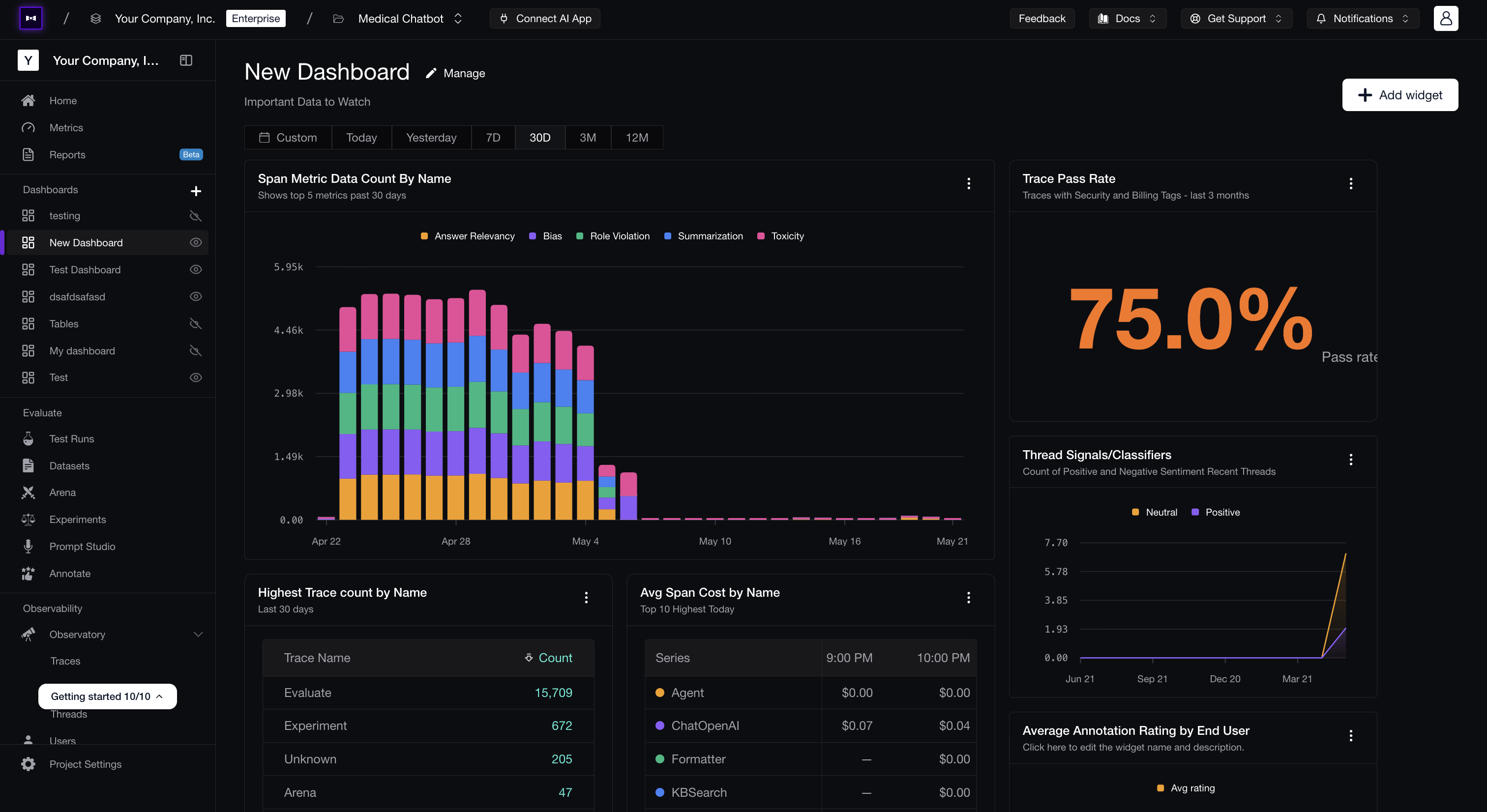
A dashboard is a draggable grid of widgets. Resize and rearrange any widget by grabbing its drag handle; layouts are saved per dashboard.
Create a Dashboard
Open Dashboards
From the project sidebar, open Dashboards. Each project can have any number of dashboards.
Add a dashboard
Click New Dashboard, give it a Name and an optional Description, decide on visibility (see below), and save. You'll land on the empty dashboard.
Choose visibility
Toggle Private to control who can see this dashboard:
- Off (default) — the dashboard is public to your project. Every project member sees it in the Dashboards list and can open it.
- On — the dashboard is private. Only you can see and open it.
You can flip visibility later from the dashboard's Manage → Edit dialog.
Add a widget
Click Add widget to open the widget selector. Pick the data shape (Time series or Categorical — see below) and configure the widget in the editor.
Choose a Widget Shape
When you add a widget, the first thing you pick is the data shape. The shape decides whether your data is bucketed across time or aggregated as a single snapshot.
| Shape | Description |
|---|---|
| Time series | Track how a metric changes across time buckets — line, area, bar, stacked bar, or transposed table. |
| Categorical | Aggregate over the time range without time buckets — big number, bar, stacked bar, or table. |
Once you pick a shape, you'll see the matching display types in the editor. Switch between them at any time without losing your configuration.
Time-Series Widgets
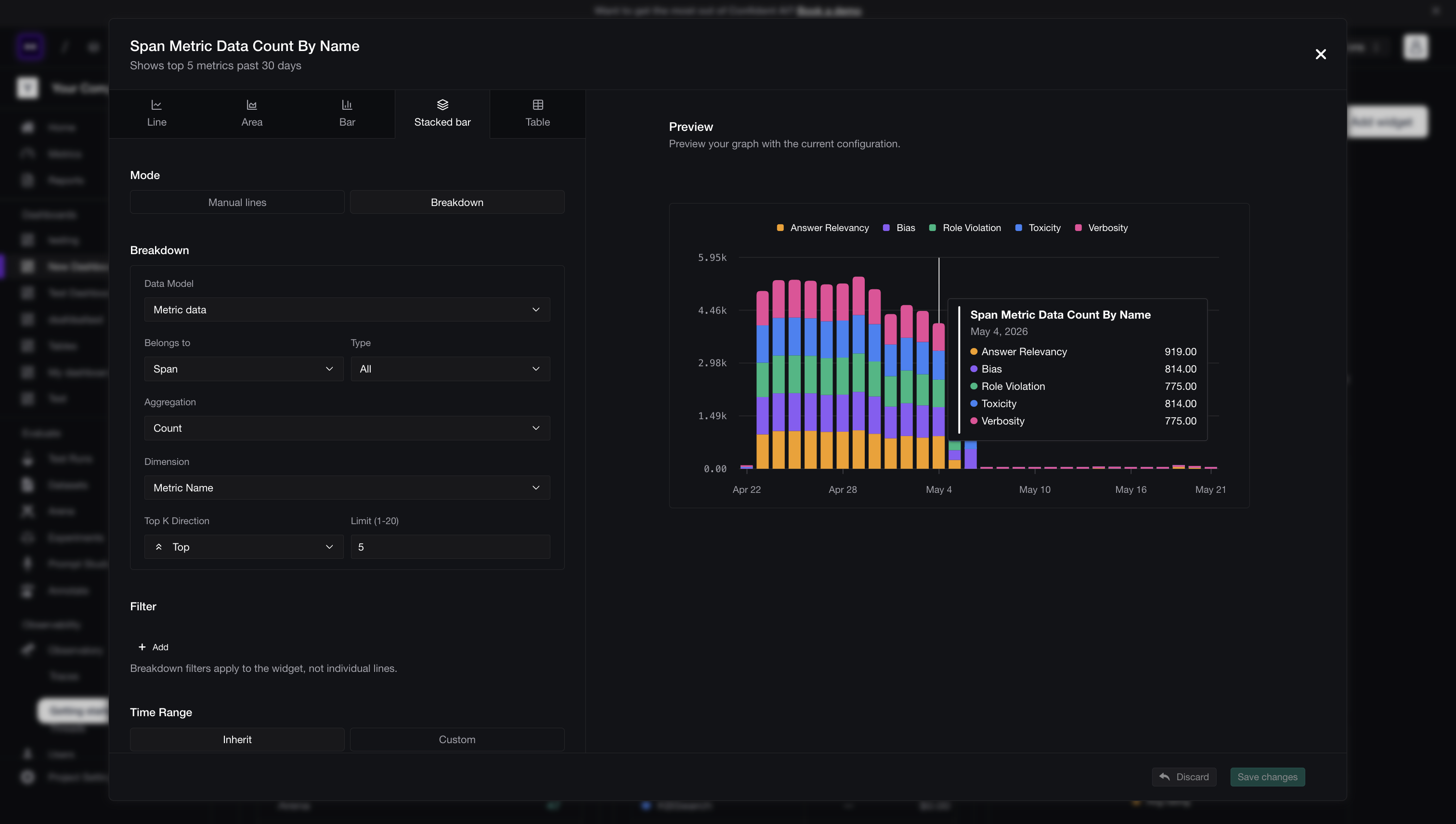
Time-series widgets answer "how does X change over time?". They bucket your data into intervals (the bucket size scales with the date range) and plot one value per bucket.
| Display type | Best for |
|---|---|
| Line | Trend lines for one or more metrics. Good for latency, error rate, score averages. |
| Area | Same as line, but filled — useful when one series dominates and you want emphasis. |
| Bar | Discrete values per bucket. Good for trace counts per day or evals run per hour. |
| Stacked bar | A bar chart broken down by dimension, stacked so the total per bucket is also visible. |
| Time-series table | The same data as a graph but in tabular form — rows are series, columns are time buckets. |
Categorical Widgets
Categorical widgets answer "what's the distribution / what's the headline?" over a fixed window — no time buckets.
| Display type | Best for |
|---|---|
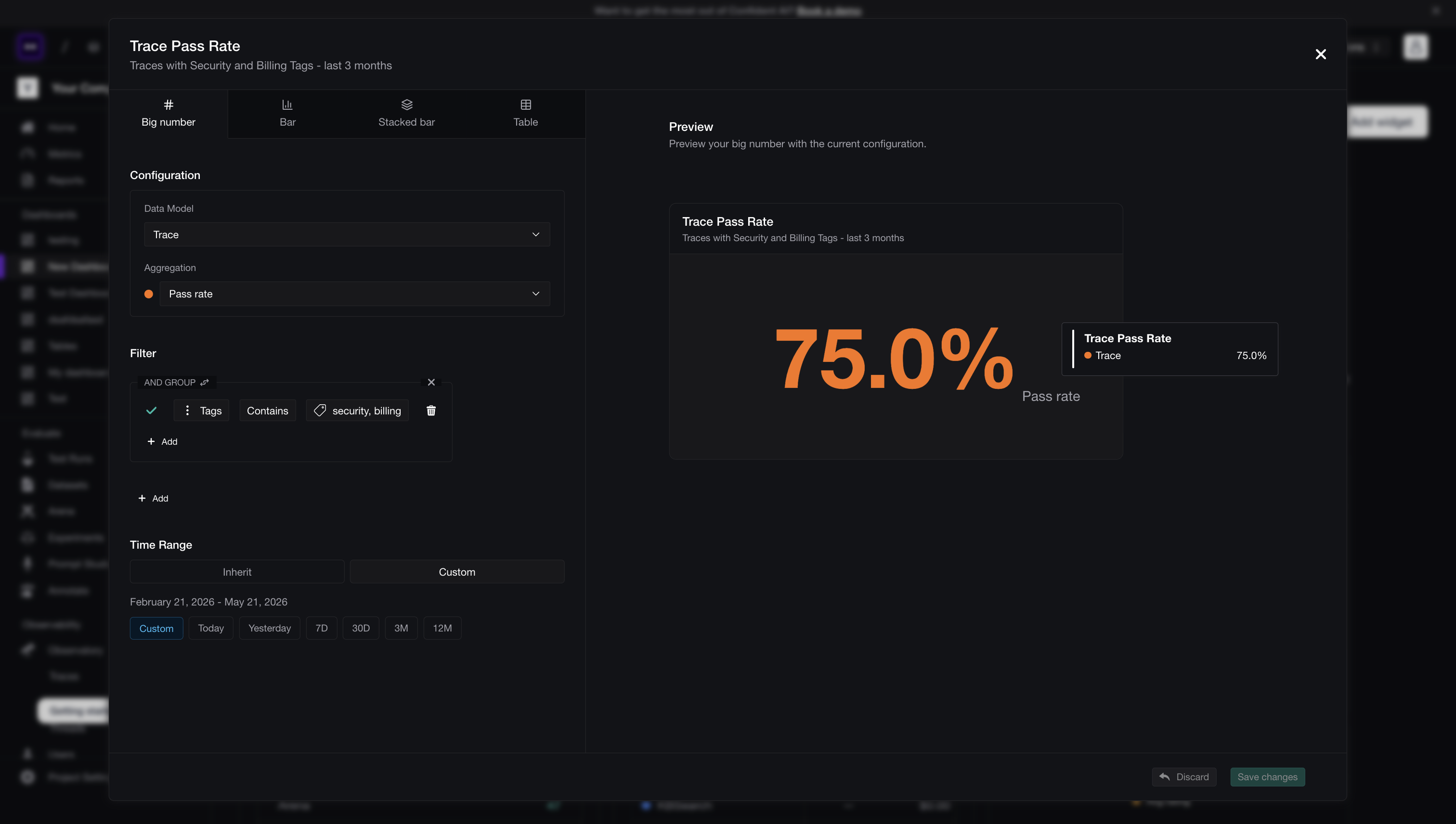
| Big number | A single headline value — total traces, average score, unique end users — for the date range. |
| Bar | A snapshot bar chart broken down by dimension (e.g. trace count by Failure Mode label). |
| Stacked bar | The same snapshot stacked by a sub-dimension — good when one bar represents multiple categories. |
| Table | A sortable categorical table with multiple aggregation columns — the most flexible "give me the numbers" widget. |
Configure a Widget
Inside the widget editor, set what data is plotted and how it's sliced.
Data Model
The Data Model is the source of the values your widget reads. Pick one of:
| Data model | What it counts |
|---|---|
| Trace | Top-level traces ingested into the project. |
| Span | Individual spans within traces. Optionally narrow by Type — LLM, Tool, Retriever, Agent, Embedding, etc. |
| Thread | Multi-turn conversations (threads). |
| Metric Data | Online-evaluation scores produced on traces, spans, or threads. Pick which entity the scores belong to. |
| Annotation | Human annotations left on traces, spans, threads, or test cases. Pick the entity (Belongs to) and optionally a Source (e.g. queue). |
For Span, Metric Data, and Annotation, the editor reveals nested selectors so you can scope deeper without picking the wrong dimension by accident.
Aggregation
The Aggregation is the value the widget plots — Count, Average latency, P95 latency, Unique end users, Average score, etc. The list of aggregations adapts to the data model you picked, so you only ever see options that make sense.
Filters
Filters narrow the dataset using the same syntax as the Observatory. Match by environment, tag, metadata field, classifier label, score, latency, or any combination — exactly the same expressions you'd build to search for traces.
In Manual mode (see below), each line has its own filters so you can compare different slices side-by-side. In Breakdown mode there's one shared filter that scopes the whole widget; the editor surfaces a hint to that effect when you toggle modes.
Manual vs Breakdown (time-series widgets)
Time-series widgets have two modes, switchable at the top of the editor:
- Manual lines — define up to 5 lines yourself, each with its own data model, aggregation, and filters. Use this when you want to compare specific things side-by-side — e.g. avg latency for
LLMspans vs. avg latency forRetrieverspans, or trace count inprodvs. trace count instaging. - Breakdown — pick one data model + aggregation, then pick a dimension. The widget auto-creates one series per value of that dimension (capped by Top K). Use this when you want to slice one metric by an attribute — e.g. trace count broken down by
Failure Modelabel or average score broken down by metric collection.
Switching modes resets the configuration so you can start fresh in the new shape.
Breakdown Dimensions
In Breakdown mode (and for categorical widgets), the Dimension controls how the metric is split. The available dimensions adapt to the data model — common ones include:
- End user — split by the
endUserIdattached to traces or threads. - Tag — split by trace tag.
- Span type —
LLM,Tool,Retriever,Agent, etc. - Metadata — split by a specific metadata key. The editor prompts you to pick or type the key (see the metadata tip above).
- Classifier — split by the labels of one of your project's classifiers. Pair this with Signals to graph things like trace count by
Failure Modelabel over time.
Top K
When a breakdown could produce many series, Top K caps the result:
- Direction —
Top(highest by value) orBottom(lowest). - Limit — an integer between
1and the configured ceiling (commonly20). The remaining values are not plotted; switching the direction or raising the limit always re-evaluates against the underlying data.
Time Range
By default a widget inherits the dashboard's date range. Toggle Custom time range in the editor to keep that one panel scoped (e.g. always last 7 days, regardless of the dashboard date) — useful for "headline KPI" widgets that should always show a fixed window.
Manage Widgets
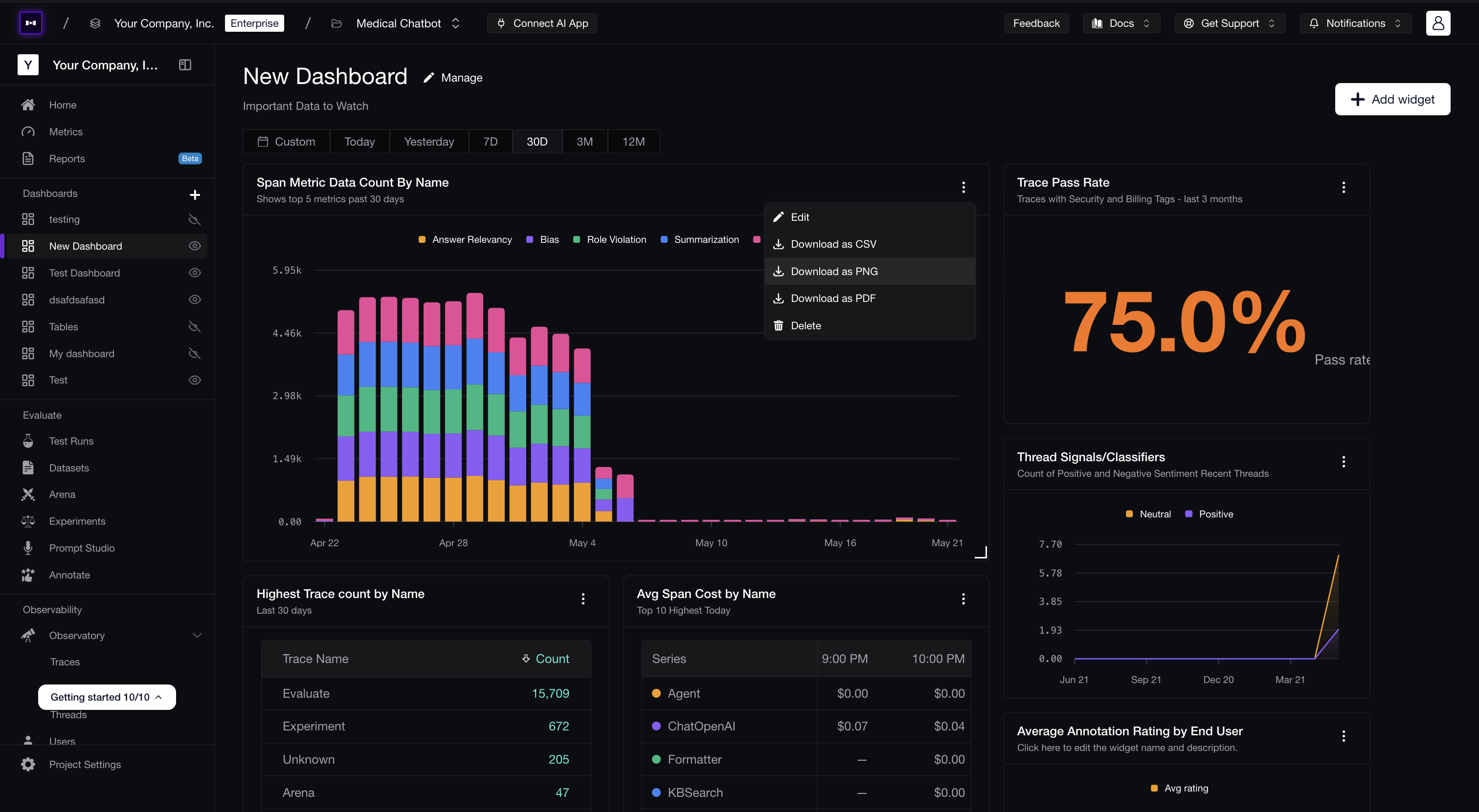
Each widget has a kebab menu (⋮) in its top-right corner with the following actions:
| Action | What it does |
|---|---|
| Edit | Re-open the widget editor. |
| Download as CSV | Export the underlying data as a CSV. (Not available for Big Number widgets.) |
| Download as PNG | Capture the rendered widget as a PNG image, exactly as it appears on the dashboard. |
| Download as PDF | Same capture, embedded into a PDF — landscape for graphs, portrait for tables/tiles. |
| Delete | Remove the widget from the dashboard. (The dashboard itself is unaffected.) |
PNG and PDF exports use the widget's current rendered state — title, legend, axes, and data — so the exported file matches what you see. Filenames default to the widget's name, sanitized for the filesystem.
Manage the Dashboard
The Manage button in the dashboard header opens a dropdown with Edit (rename, change description, flip visibility) and Delete. Deleting a dashboard removes it and all of its widgets — the underlying trace, thread, metric, and annotation data is unaffected.
To rearrange the layout, drag a widget by its drag handle to move it, or drag a widget edge to resize it. Layouts persist as soon as you let go.
Signals
Use classifier labels as breakdowns or filters on dashboard widgets.
Custom Reports
Generate AI-written narrative reports over the same data, on a daily schedule.
Last updated on